Add linear equation to a plot
In this post, I am going to show different ways of adding a linear equation to a plot. I will use the diamonds dataset that is within the ggplot2 package. The dataset has nearly 54,000 observations and 10 variables as shown below.
library(ggplot2)
library(ggpmisc)
library(ggthemes)
library(foreign)
suppressMessages(library(dplyr))
library(reshape2)
library(psych)
There are many ways of loading data but in this case, I choose to do as shown below. Below we see that the structure of the diamonds dataset - using the str function.
diamonds <- ggplot2::diamonds

dim(diamonds)
## [1] 53940 10str(diamonds)## tibble [53,940 × 10] (S3: tbl_df/tbl/data.frame)
## $ carat : num [1:53940] 0.23 0.21 0.23 0.29 0.31 0.24 0.24 0.26 0.22 0.23 ...
## $ cut : Ord.factor w/ 5 levels "Fair"<"Good"<..: 5 4 2 4 2 3 3 3 1 3 ...
## $ color : Ord.factor w/ 7 levels "D"<"E"<"F"<"G"<..: 2 2 2 6 7 7 6 5 2 5 ...
## $ clarity: Ord.factor w/ 8 levels "I1"<"SI2"<"SI1"<..: 2 3 5 4 2 6 7 3 4 5 ...
## $ depth : num [1:53940] 61.5 59.8 56.9 62.4 63.3 62.8 62.3 61.9 65.1 59.4 ...
## $ table : num [1:53940] 55 61 65 58 58 57 57 55 61 61 ...
## $ price : int [1:53940] 326 326 327 334 335 336 336 337 337 338 ...
## $ x : num [1:53940] 3.95 3.89 4.05 4.2 4.34 3.94 3.95 4.07 3.87 4 ...
## $ y : num [1:53940] 3.98 3.84 4.07 4.23 4.35 3.96 3.98 4.11 3.78 4.05 ...
## $ z : num [1:53940] 2.43 2.31 2.31 2.63 2.75 2.48 2.47 2.53 2.49 2.39 ...Explore dataset
A good start for summarizing a dataset (especially for datasets with few number of columns), is the use of the base summary function as below. The result is a summary of each column in the dataset - frequency for categories within a categorical variable and summary statistics for numeric variables.
#general summary of all variables
summary(diamonds)
## carat cut color clarity depth
## Min. :0.2000 Fair : 1610 D: 6775 SI1 :13065 Min. :43.00
## 1st Qu.:0.4000 Good : 4906 E: 9797 VS2 :12258 1st Qu.:61.00
## Median :0.7000 Very Good:12082 F: 9542 SI2 : 9194 Median :61.80
## Mean :0.7979 Premium :13791 G:11292 VS1 : 8171 Mean :61.75
## 3rd Qu.:1.0400 Ideal :21551 H: 8304 VVS2 : 5066 3rd Qu.:62.50
## Max. :5.0100 I: 5422 VVS1 : 3655 Max. :79.00
## J: 2808 (Other): 2531
## table price x y
## Min. :43.00 Min. : 326 Min. : 0.000 Min. : 0.000
## 1st Qu.:56.00 1st Qu.: 950 1st Qu.: 4.710 1st Qu.: 4.720
## Median :57.00 Median : 2401 Median : 5.700 Median : 5.710
## Mean :57.46 Mean : 3933 Mean : 5.731 Mean : 5.735
## 3rd Qu.:59.00 3rd Qu.: 5324 3rd Qu.: 6.540 3rd Qu.: 6.540
## Max. :95.00 Max. :18823 Max. :10.740 Max. :58.900
##
## z
## Min. : 0.000
## 1st Qu.: 2.910
## Median : 3.530
## Mean : 3.539
## 3rd Qu.: 4.040
## Max. :31.800
## An interesting way of summarizing many numeric variables by one categorical variables is shown below. I use the describeBy function from the psych package. The table below shows the first 15 cases for 10 columns
#summary of all numeric variables by carat
summary_num <- diamonds %>%
  dplyr::select(-c(color, clarity)) %>%
  melt(id.vars = 1:2,
       variable.name = "variable_name",
       value.name = "variable_value")

summary_la <- summary_num %>%
  filter(!is.na(variable_value))

summarystats_num <- describeBy(summary_num$variable_value,
                               list(summary_la$cut, summary_la$variable_name),
                               mat = T)


row.names(summarystats_num) <- NULL

knitr::kable(summarystats_num[1:15, 1:10])| item | group1 | group2 | vars | n | mean | sd | median | trimmed | mad |
|---|---|---|---|---|---|---|---|---|---|
| 1 | Fair | depth | 1 | 1610 | 64.04168 | 3.6434275 | 65.0 | 64.47640 | 1.33434 |
| 2 | Good | depth | 1 | 4906 | 62.36588 | 2.1693739 | 63.4 | 62.69862 | 0.74130 |
| 3 | Very Good | depth | 1 | 12082 | 61.81828 | 1.3786308 | 62.1 | 61.94504 | 1.48260 |
| 4 | Premium | depth | 1 | 13791 | 61.26467 | 1.1588149 | 61.4 | 61.35593 | 1.18608 |
| 5 | Ideal | depth | 1 | 21551 | 61.70940 | 0.7185386 | 61.8 | 61.75589 | 0.59304 |
| 6 | Fair | table | 1 | 1610 | 59.05379 | 3.9462613 | 58.0 | 58.64394 | 2.96520 |
| 7 | Good | table | 1 | 4906 | 58.69464 | 2.8512997 | 58.0 | 58.57112 | 2.96520 |
| 8 | Very Good | table | 1 | 12082 | 57.95615 | 2.1214481 | 58.0 | 57.88342 | 1.48260 |
| 9 | Premium | table | 1 | 13791 | 58.74610 | 1.4785733 | 59.0 | 58.77009 | 1.48260 |
| 10 | Ideal | table | 1 | 21551 | 55.95167 | 1.2464233 | 56.0 | 55.97404 | 1.48260 |
| 11 | Fair | price | 1 | 1610 | 4358.75776 | 3560.3866123 | 3282.0 | 3695.64752 | 2183.12850 |
| 12 | Good | price | 1 | 4906 | 3928.86445 | 3681.5895839 | 3050.5 | 3251.50637 | 2853.26370 |
| 13 | Very Good | price | 1 | 12082 | 3981.75989 | 3935.8621606 | 2648.0 | 3243.21664 | 2855.48760 |
| 14 | Premium | price | 1 | 13791 | 4584.25770 | 4349.2049615 | 3185.0 | 3822.23122 | 3371.43240 |
| 15 | Ideal | price | 1 | 21551 | 3457.54197 | 3808.4011723 | 1810.0 | 2656.13601 | 1630.86000 |
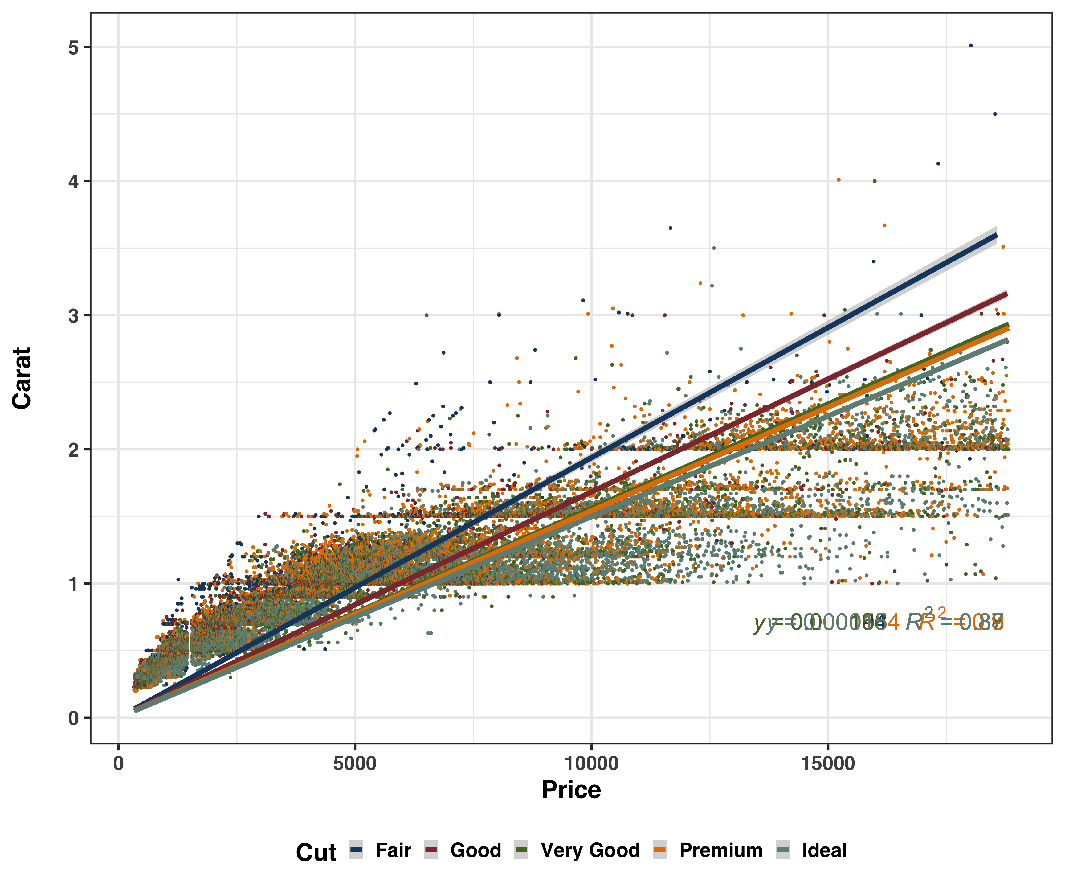
Besides computation of numerical data summaries, use of data visualizations is a very great way to explore data. A plot showing bivariate distributions betweeen price and carat is shown below for each level of cut.
Note there are no prior assumptions made about the distribution of the variables.
#plot of diamond price by carat grouped by cut
formula_lm <- y ~ x

ggplot(diamonds,
       aes(x = price,
           y = carat,
           color = cut)) +
    geom_point() +
    geom_smooth(method = "lm", size = 3, se = T, formula = formula_lm) +
    stat_poly_eq(aes(label = paste(..eq.label.., ..rr.label.., sep = "~~~")),
               label.x.npc = "right", label.y.npc = 0.15,
               formula = formula_lm, parse = TRUE, size = 10) +
    theme_bw(base_size = 30, base_family = "sans") +
  theme(axis.text = element_text(face = "bold"),
        legend.text = element_text(face = "bold"),
        legend.title = element_text(face = "bold"),
        axis.title = element_text(face = "bold"),
        strip.text = element_text(face = "bold"),
        legend.position = "bottom") +
  scale_color_stata() +
  #facet_wrap(~cut) +
  labs(x = "Price",
       y = "Carat\n",
       color = "Cut")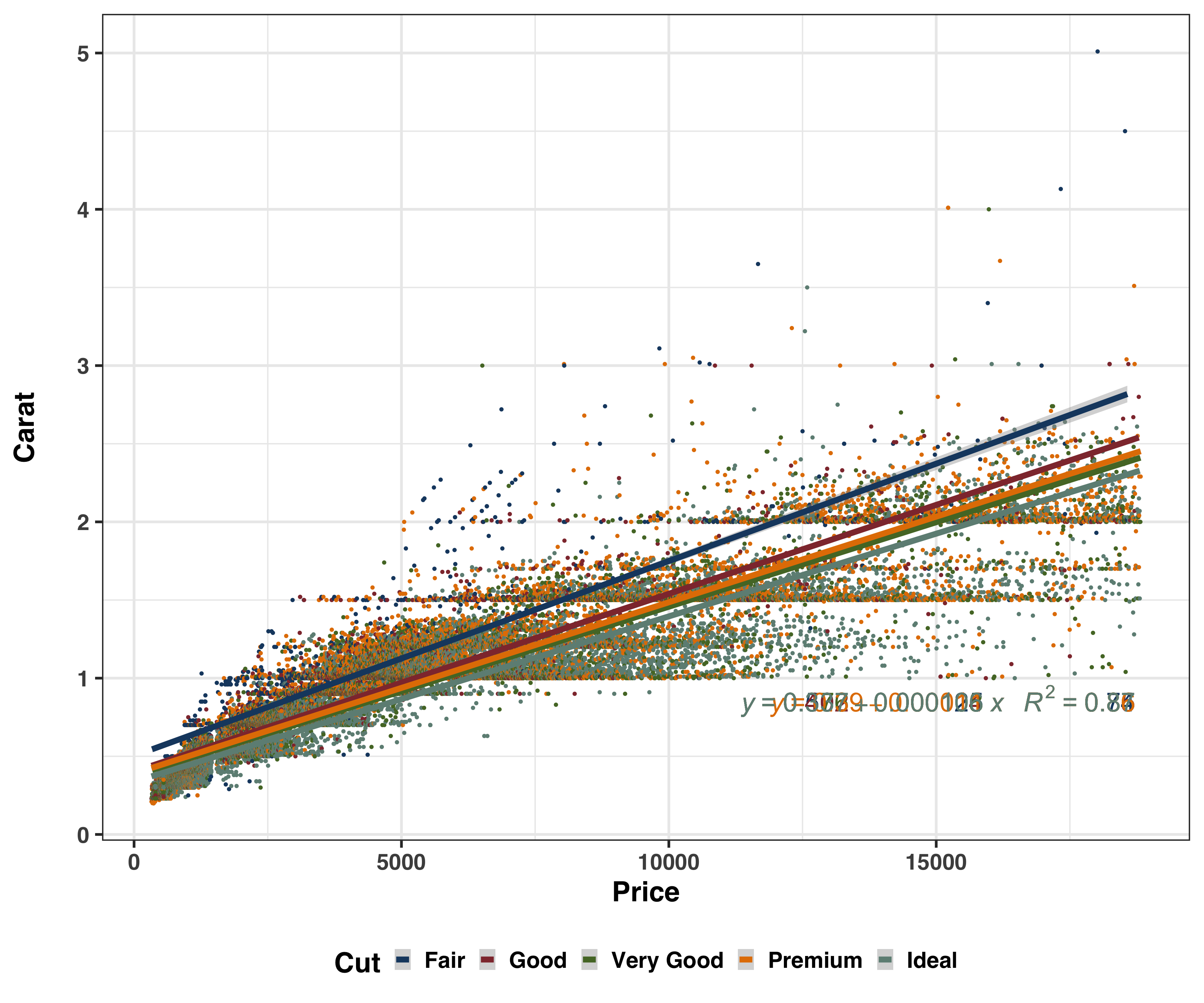
The plot below shows a scatterplot of price and carat with the linear regression line plotted through the origin.
#with the line starting at the origin
formula_lm <- y ~ 0 + x

ggplot(diamonds,
       aes(x = price,
           y = carat,
           color = cut)) +
    geom_point() +
    geom_smooth(method = "lm", size = 3, se = T, formula = formula_lm) +
    stat_poly_eq(aes(label = paste(..eq.label.., ..rr.label.., sep = "~~~")),
               label.x.npc = "right", label.y.npc = 0.15,
               formula = formula_lm, parse = TRUE, size = 10) +
    theme_bw(base_size = 30, base_family = "sans") +
  theme(axis.text = element_text(face = "bold"),
        legend.text = element_text(face = "bold"),
        legend.title = element_text(face = "bold"),
        axis.title = element_text(face = "bold"),
        strip.text = element_text(face = "bold"),
        legend.position = "bottom") +
  scale_color_stata() +
  #facet_wrap(~cut) +
  labs(x = "Price",
       y = "Carat\n",
       color = "Cut")